

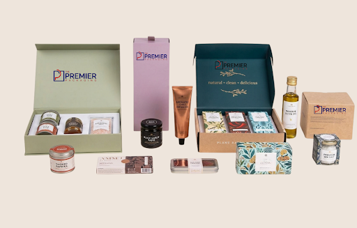
There’s this split second before someone opens a cosmetic box for the first time. Nothing’s happened yet. No formula tested, no texture felt. Just the box in their hand, doing all the talking on its own. A lot of brands treat that second like an afterthought, something to sort out once the actual product’s locked in. The ones that get it right don’t. They treat the box like it’s part of the product.
So what actually separates a box that pulls its weight from one that quietly drags a good product down? A few things keep coming up.
Construction That Doesn’t Feel Like a Cost-Cutting Decision
Sounds obvious, but this gets skipped more than you’d think. A box needs to hold its shape. Corners shouldn’t crush the first time someone picks it up. Lids shouldn’t pop open on their own or feel loose in a way that screams “cheap.”
Board weight matters way more than most people assume going in. Thin stock saves a few cents a unit, sure, but it costs something harder to put a number on, that instant gut reaction a customer has the second they pick the box up off a shelf. Getting the weight and rigidity right is honestly one of the cheapest ways to buy some credibility before anyone’s even opened the thing.
Enough Room for the Branding to Actually Register
A logo crammed into a corner, squeezed next to a barcode and an ingredient list, doesn’t help anybody. Good packaging gives branding room to breathe. Clean space where a logo, a color palette, whatever, can actually land with someone glancing at a shelf or scrolling past a photo on their phone.
Part of why so many brands moving upmarket invest in luxury cosmetic packaging built specifically around their own identity, instead of grabbing a stock template and slapping a logo on it. The gap shows up fast once you put that box next to something generic.
A Finish That Actually Matches What the Product’s Claiming to Be
Matte, glossy, soft-touch, foil, embossed, there’s no shortage of options, and the wrong pick sends the wrong signal even if everything else about the box is solid. A budget product covered in heavy foil accents can come off almost desperate. A genuinely premium serum stuck in a flat glossy box, meanwhile, can undersell itself before anyone’s even read the label.
The finish needs to match the price point and whatever story the brand’s telling. Soft-touch matte’s become the default for a lot of higher-end skincare lately, mostly because it reads as understated and expensive at once, no loud embellishment required.
Actual Protection for What’s Inside
Cosmetics break. Glass bottles, ceramic jars, pressed powder that cracks the second a box gets squeezed in a shipping truck. Decent packaging plans for this with inserts, dividers, some kind of snug inner tray that keeps the product from sliding around in transit.
This isn’t just about avoiding damage claims, either. A product that shows up cracked, even once, undoes a lot of goodwill a brand spent months building. Internal structure is nobody’s favorite part of packaging design, but it’s arguably one of the most important, unglamorous as it is.
Labeling That Doesn’t Fight the Design
Ingredient lists, usage instructions, regulatory stuff, it all has to go somewhere, and it clashes fast with the design if nobody planned for it ahead of time. The best cosmetic boxes fit everything required without making the whole thing feel cluttered, like some legal team bolted text on after the design was already finished.
Usually this means building label space in from the start, not squeezing it in at the end. Brands that plan ahead here tend to skip the awkward last-minute redesigns that happen right before a print run.
A Closure That Feels Like Someone Thought About It
How a box opens matters more than people give it credit for. A flap with a bit of resistance before it gives. A magnetic closure that snaps shut with some authority. A sleeve that slides cleanly off a tray without catching. Little details like this shape how premium something feels almost as much as the printed graphics do.
A closure that’s flimsy or unpredictable, one that pops open in a bag or doesn’t sit flush, undercuts the whole thing even if the graphics look great. Easy to miss this during early design reviews. Impossible to miss once a real customer’s holding the finished product.
Consistency Across Everything the Brand Sells
One good box is a fine start. The real payoff shows up when every product in a line shares the same build quality, finish, and branding language. Customers start recognizing a brand almost on sight after a while, sometimes before the logo even fully registers.
Final Words
None of this stuff works in isolation, honestly. A sturdy box with a sloppy finish still reads cheap. Great branding on flimsy board still feels hollow the second it’s picked up. Brands that get cosmetic packaging right treat construction, finish, protection, labeling, and closure as one connected thing, not a checklist you tick off one item at a time. Get that balance right and the box does real work for the brand before a customer’s even opened it.
For More Info Visit:- marketingbiznews.com
 David Martinez